EnvMap: An Environmental Trends Explorer
Explore CO₂ and greenhouse-gas trends across countries and years with a fast, reliable map.
Project Overview
After seeing countless data visualizations on instagram, tiktok, and YouTube, I felt that they could be used to further public knowledge of environmental issues, creating a huge impact. EnvMap is a Streamlit app that visualizes environmental indicators using the Our World in Data (OWID) CO₂ & GHG dataset. You can animate change over time, lock the color scale for apples-to-apples comparisons across years, and drill down into country trend lines for side-by-side analysis.
What You Can Do
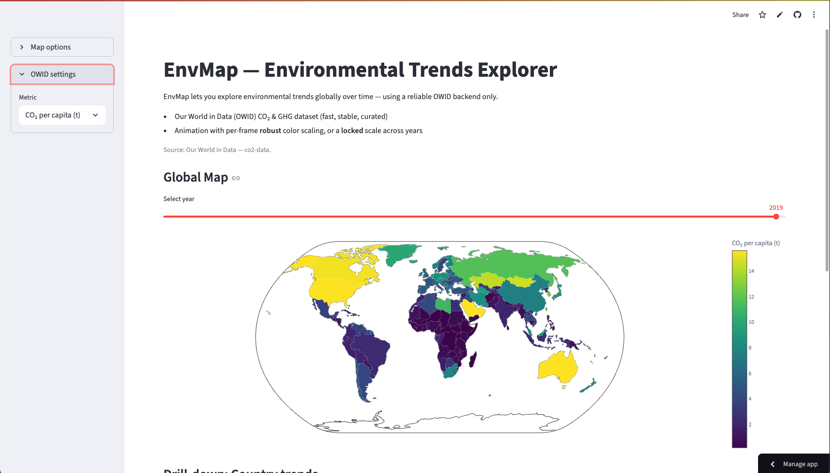
- Global map: View CO₂ & GHG metrics (totals or per-capita) for any available year.
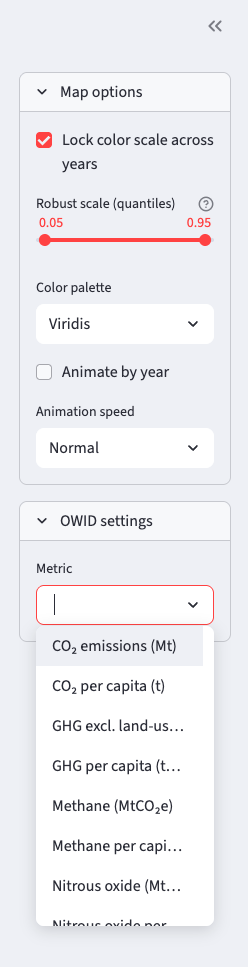
- Animate change: Play through years with robust per-frame scaling, or a locked scale for fair comparisons.
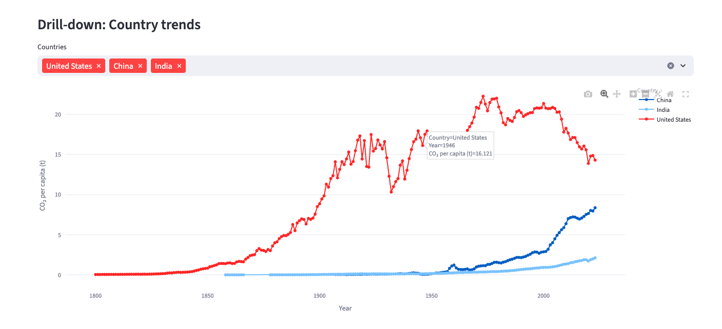
- Country drill-down: Add countries to a trends chart to compare trajectories.
- Palette control: Switch among Viridis, Plasma, Cividis, and more for clarity & accessibility.
How It's Built
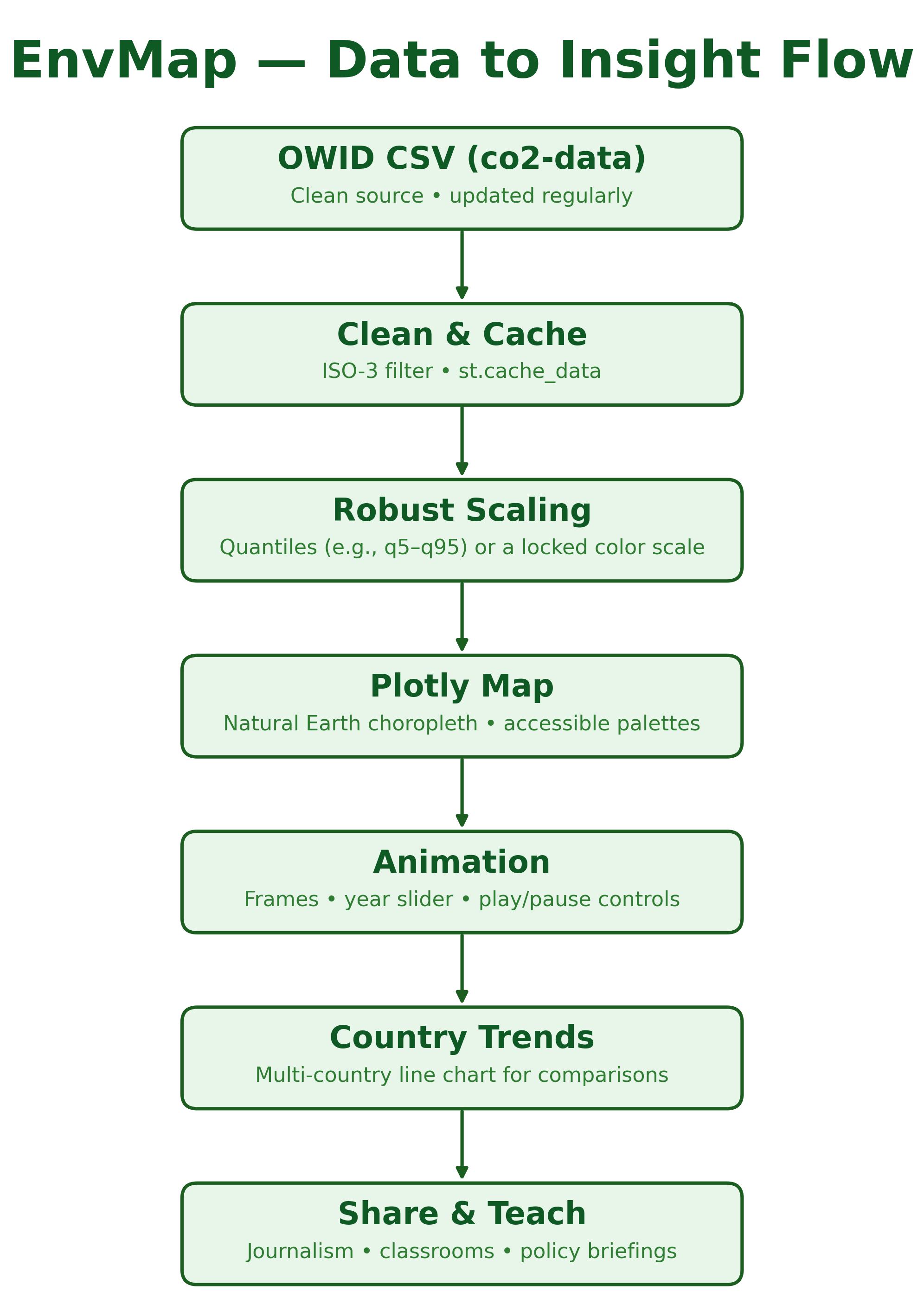
- Data: Direct CSV from OWID (
owid-co2-data.csv), filtered to ISO-3 countries. - Caching:
st.cache_datafor speedy loads and daily refresh. - Maps: Plotly
go.Choroplethwith Natural Earth projection. - Robust scaling: Quantile-based
zmin/zmax(e.g., 5–95%) to avoid outlier-flattened colors; optional global lock across all years. - Animation: Plotly frames + slider and play/pause; adjustable speed.
- Trends: Plotly Express line chart for selected countries.
Environmental & Social Impact
- Public understanding: Turns complex tables into an intuitive global picture.
- Equity lens: Per-capita views surface fairness questions beyond raw totals.
- Better conversations: Helps students, reporters, and officials spot trends and discuss realistic paths forward.
Data Source & Citation
Hannah Ritchie, Pablo Rosado, and Max Roser (2023) — “CO₂ and Greenhouse Gas Emissions.” Published online at OurWorldinData.org. Retrieved from: https://ourworldindata.org/co2-and-greenhouse-gas-emissions [Online Resource]
Key Features
Reliable Data
Direct OWID backend; fast, stable, and well-documented.
Robust Scaling
Quantile-based color limits or a locked scale across years.
Year-by-Year Animation
See change over time with a simple slider and play/pause controls.
Country Trend Lines
Pick countries and compare trajectories on one chart.
Project Details
Updated
Feb 2024 - May 2024
Live App
Impact
Clear visuals improve climate literacy, highlight equity via per-capita views, and support better policy conversations.
Technologies Used
Outcomes
- Instant global comparisons
- Per-capita fairness lens
- Year-over-year animations
- Teacher & journalist-friendly
Data Source
Hannah Ritchie, Pablo Rosado, and Max Roser (2023) — “CO₂ and Greenhouse Gas Emissions.” OurWorldinData.org. Link